Audience
Understand who is taking your Riddle – which domains it is embedded on, which countries your audience comes from, what devices and operating systems they use, and when peak traffic occurs. Use domain data to see which website placements drive the most engagement, and device breakdowns to ensure your Riddle works well on mobile.
- Hover over any slice of a pie chart to see the exact number of any given variable.
- The default view and time range is set to current week. To view live stats, click on the down arrow on the right and click on LIVE STATS. As soon as the Riddle is viewed or played, all associated statistics will appear on this dashboard here as they come in without refreshing the page.
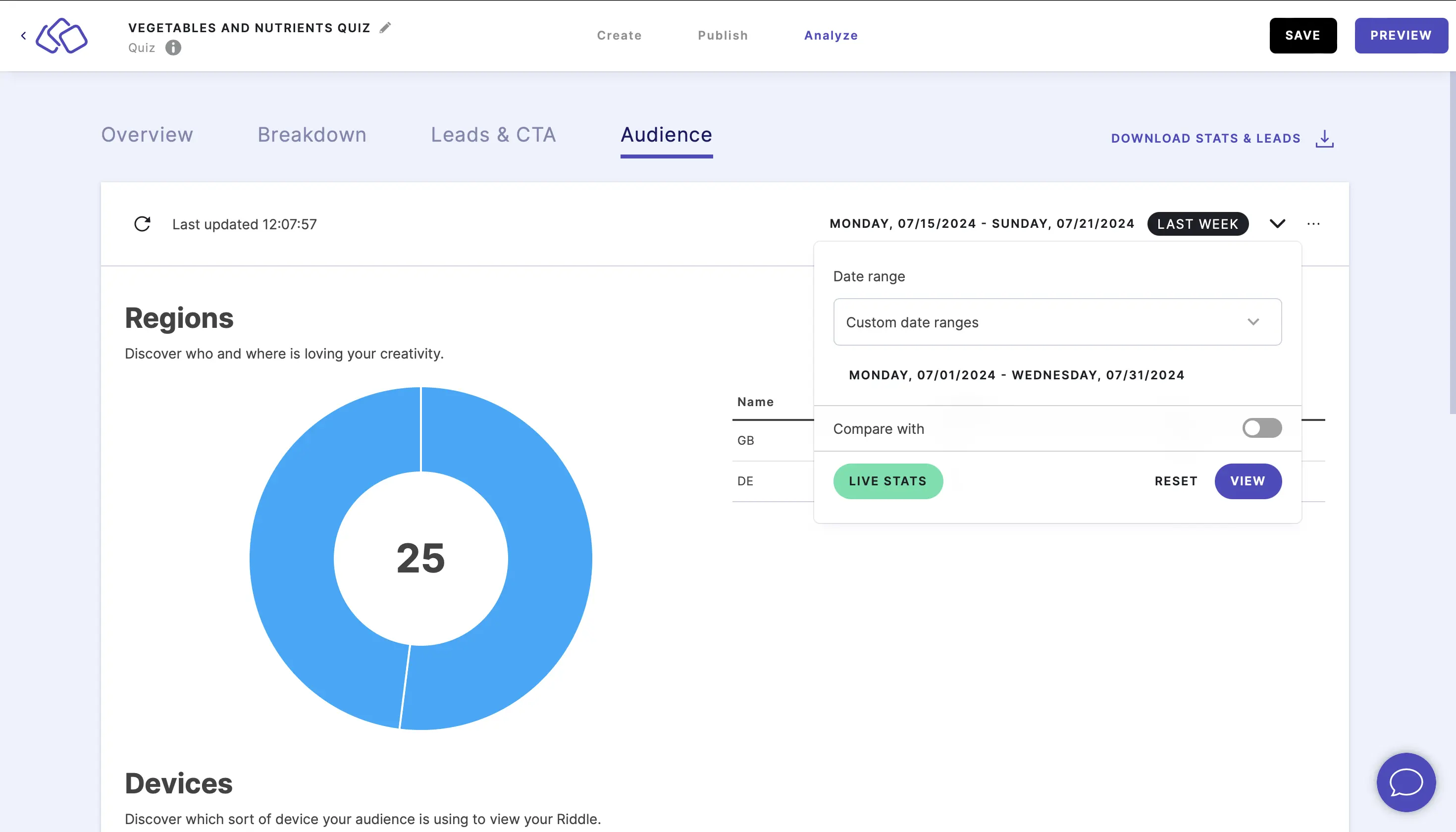
- To filter the stats to a specific time frame, click on the down arrow on the right, select a date range, and click on VIEW.

- To compare two custom time ranges, click on the down arrow on the right, select and input Custom date ranges, enable Compare with, and click on VIEW.

- To delete stats, click on the three dots on the right, click on RESET STATS, and in the pop-up that appears select the checkbox and click on OK.
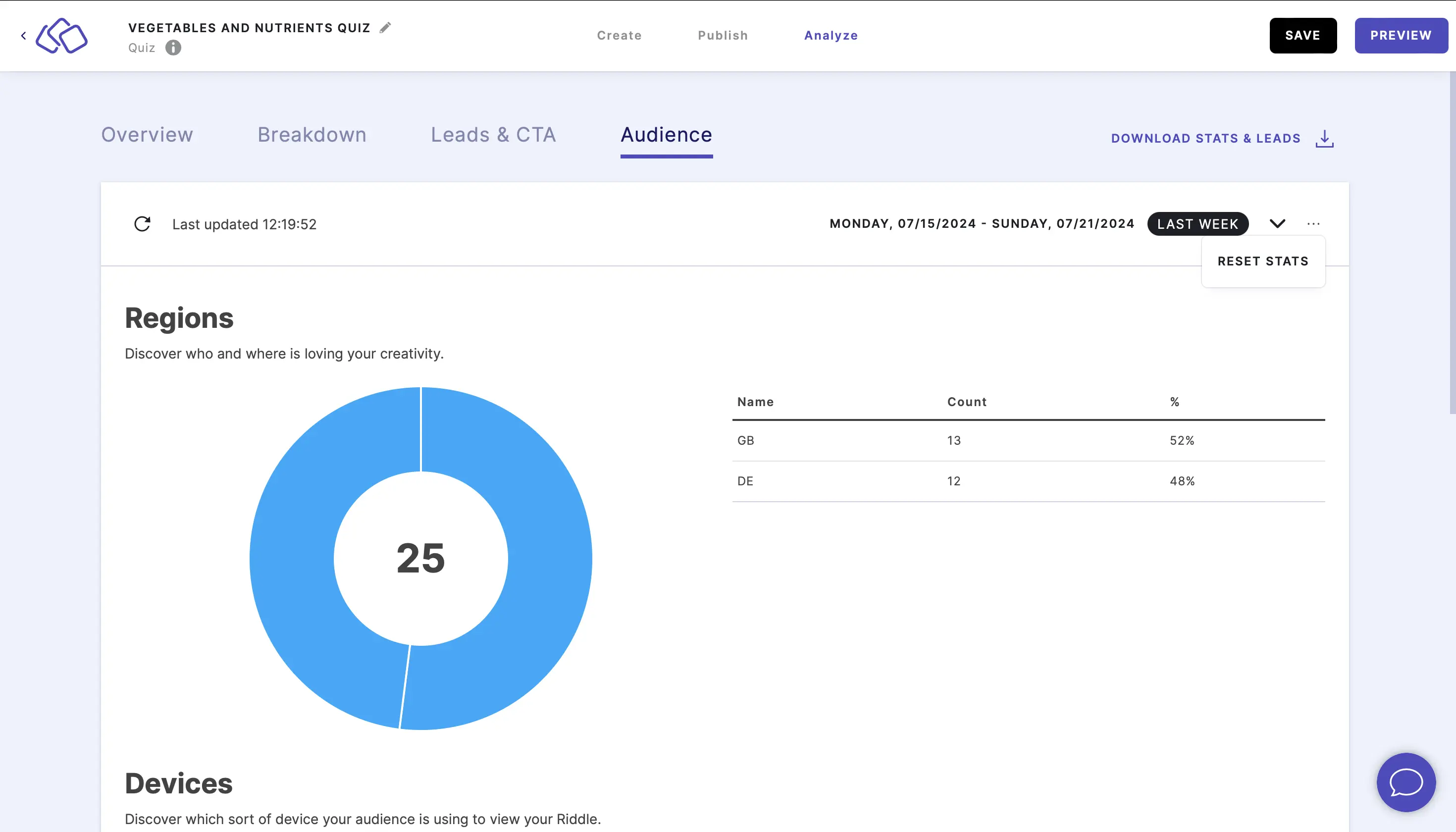
Caution: This will delete all stats for this Riddle.
Understand domains
Domain is the website your audience viewed the content on.
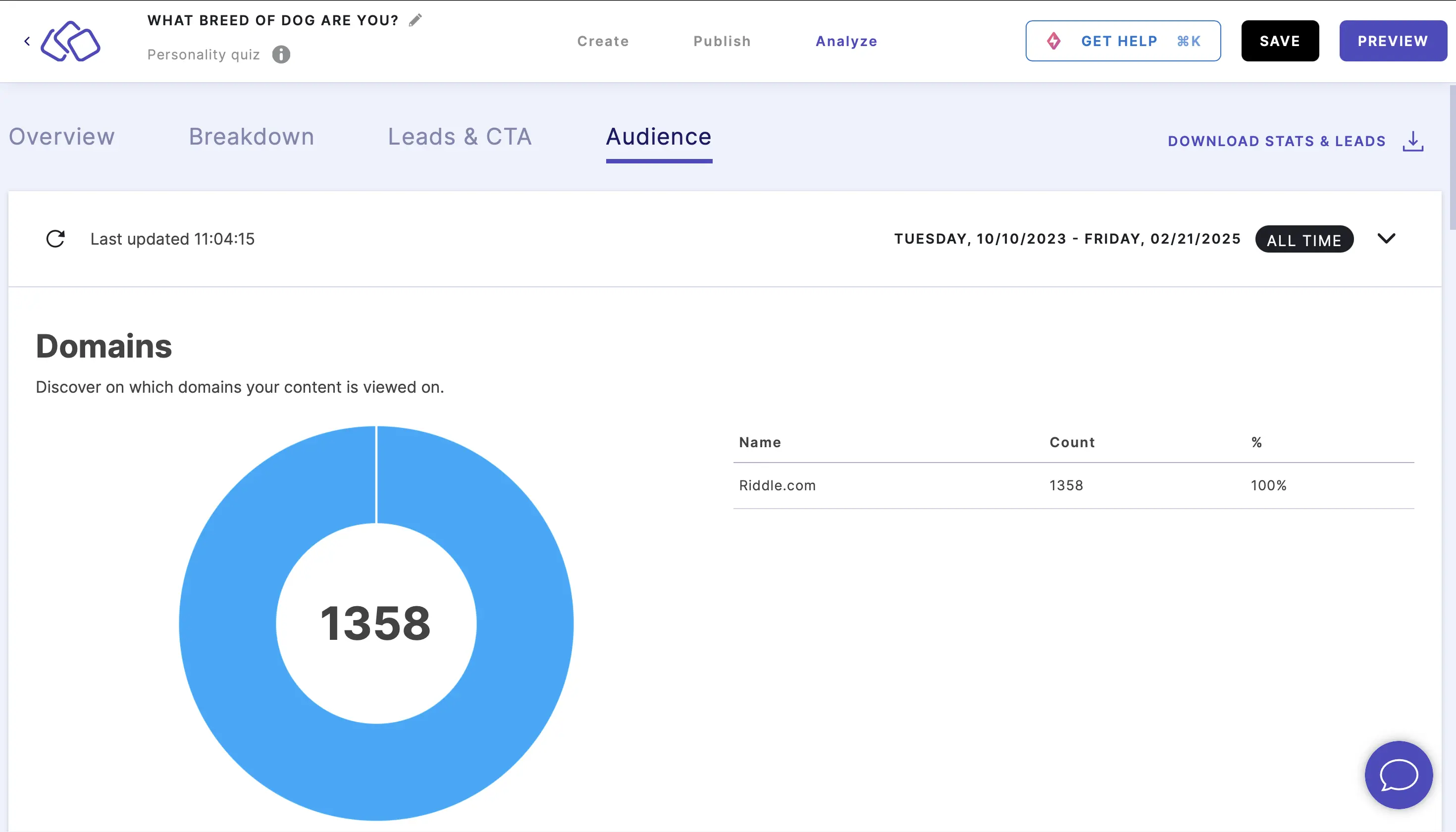
The pie chart shows the total number of views in the middle with segments representing each different domain.
The table on the right of the pie chart represents this same information in three columns:
- Name - the domain name where the Riddle was viewed
- Count - the number of times the Riddle was viewed on that domain
- % - the percentage of total views that domain represents
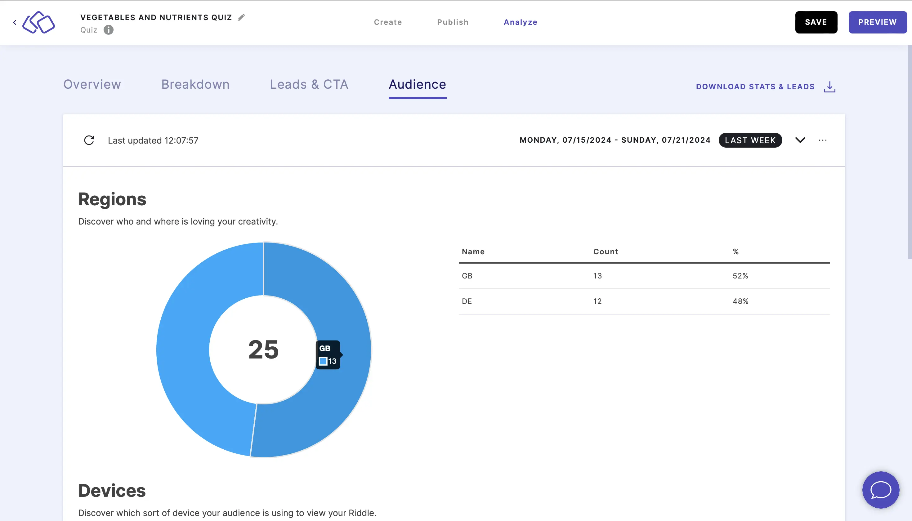
Understand regions
Region is the location of your audience based on the their browser language.
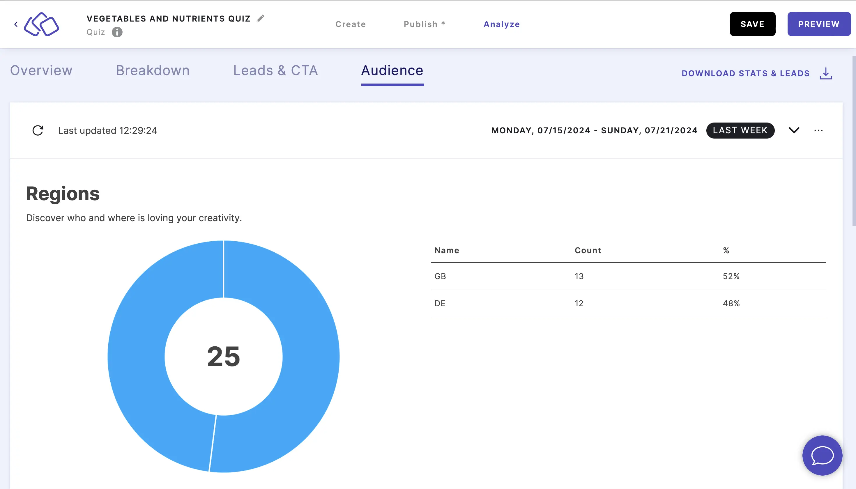
The pie chart shows the total number of views in the middle with segments representing each different country.
The table on the right of the pie chart represents this same information in three columns:
- Name - the country code where the Riddle was viewed
- Count - the number of times the Riddle was viewed in that country
- % - the percentage of total views that country represents
Understand devices
Go to Device to see what devices your audience is using. This is based on the audience's user agent.
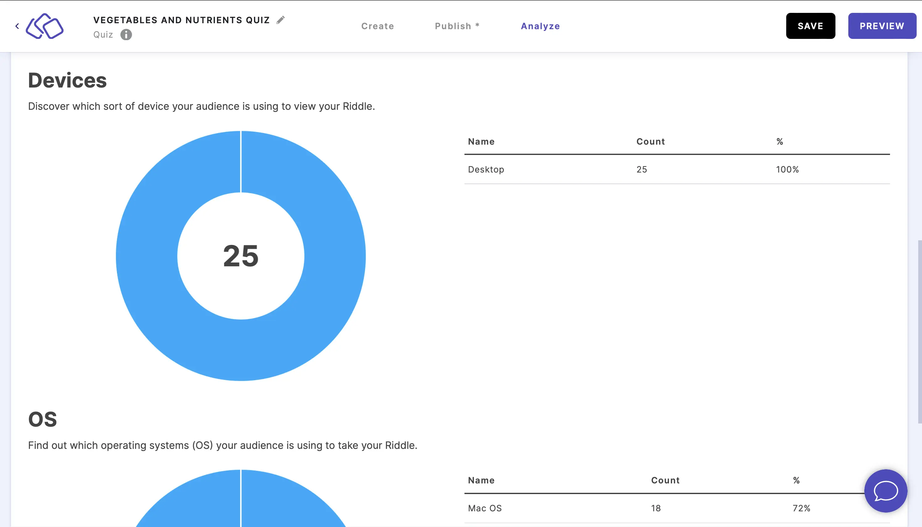
The pie chart shows the total number of views in the middle with segments representing each type of device.
The table on the right of the pie chart represents this same information in three columns:
- Name - the device type on which the Riddle was viewed
- Count - the number of times the Riddle was viewed on that type of device
- % - is the percentage of total views that device represents
Understand OS
OS (operating systems) are the operating systems your audience is using to . This is based on the audience's user agent.
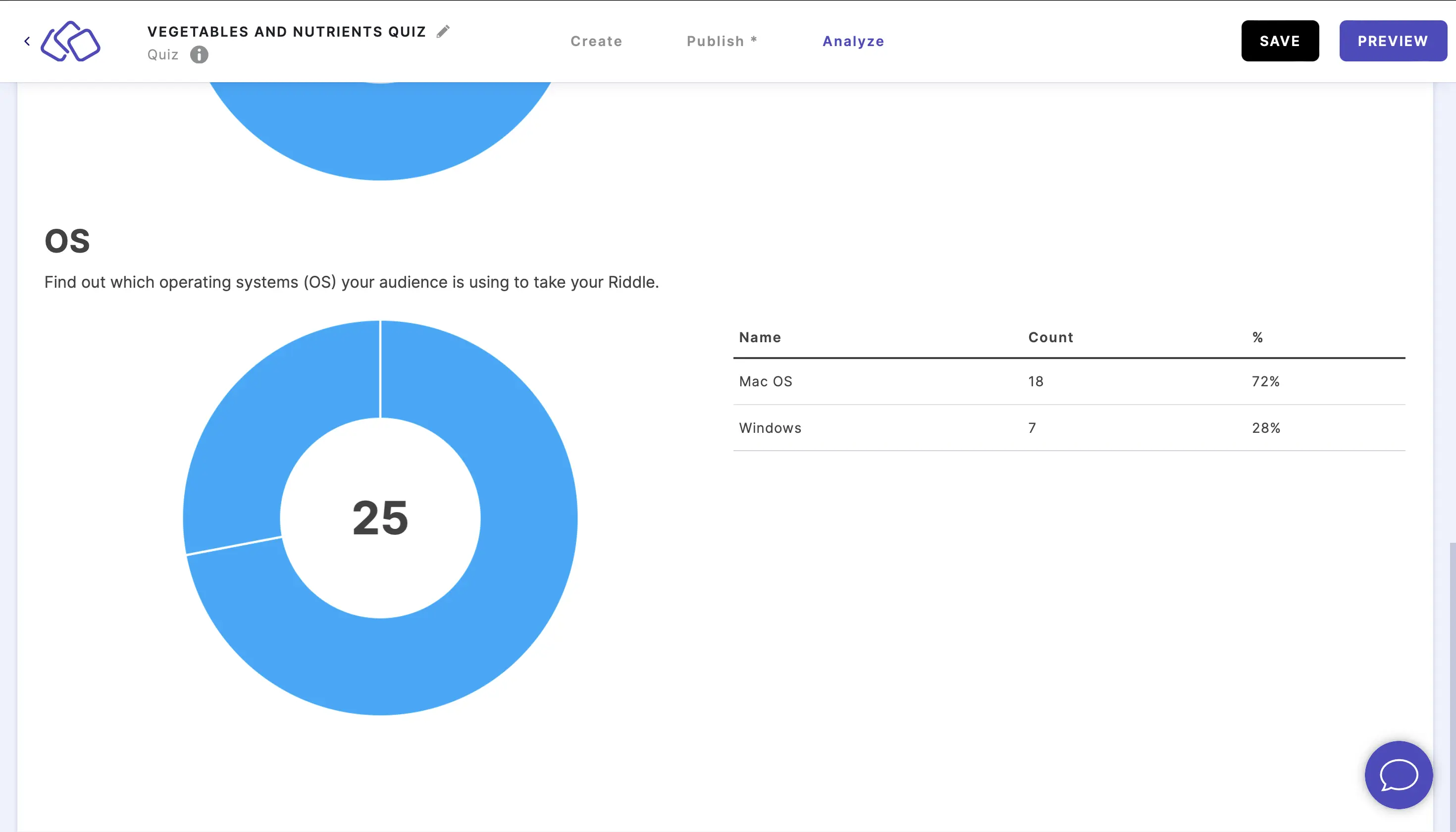
The pie chart shows the total number of views in the middle with segments representing each type of operating system.
The table on the right of the pie chart represents this same information in three columns:
- Name - the operating system on which the Riddle was viewed
- Count - the number of times the Riddle was viewed on that type of operating system
- % - the percentage of total views that operating system represents
Understand peak concurrent users
Peak Concurrent Users shows the maximum number of users who were actively viewing or playing your Riddle at the same time during the selected time period. This metric helps you understand peak engagement moments and identify when your content experiences the highest simultaneous activity.

The metric displays:
- The peak number of concurrent users
- The date and time when this peak occurred
- Trends over time to identify patterns in simultaneous usage
This is particularly useful for:
- Understanding when your audience is most engaged
- Planning content releases or campaigns around peak times
- Identifying viral moments or traffic spikes
- Capacity planning for high-traffic events
Note: For deeper analysis of Peak Concurrent Users, including breakdowns by date, project, or individual Riddle, you can use Google Data Studio.